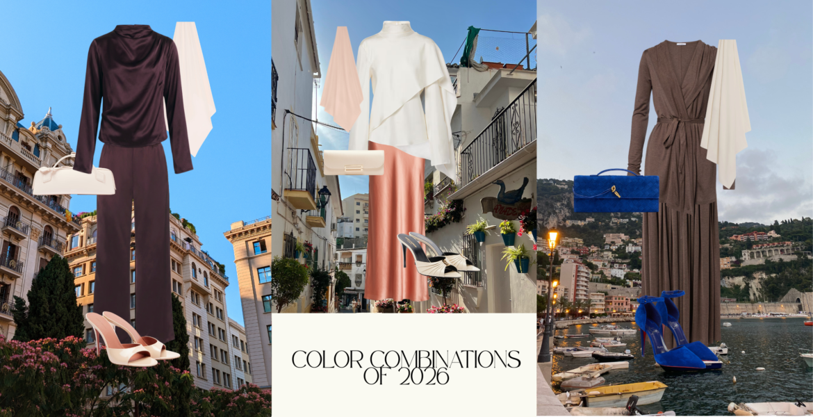
Color Combinations for Summer 2026 Outfits

3 Color Combinations the Fashion World Cannot Stop Wearing This Summer

A color combination is the deliberate pairing of two or more hues within a single outfit to create visual harmony, contrast, or both. The right color combination elevates basic silhouettes into something that looks intentionally styled, while the wrong one makes even designer pieces feel disconnected. This summer, the most compelling color combinations share one quality: they pair a rich, saturated shade with a softer neutral or complementary tone to create outfits that feel both bold and refined.
We recently explored the biggest summer color trends shaping 2026. Today we are showing you exactly how to wear those colors together in three complete outfits built from pieces you can shop right now. Every combination here is modest, polished, and grounded in color theory that actually works.

Why Do Certain Color Combinations Work Better Than Others?

Color theory is not just for artists and interior designers. It applies directly to how you get dressed every morning. The combinations that consistently look expensive share a principle: they create contrast without conflict. One shade anchors the outfit while the other provides energy. One recedes, one advances. The tension between them is what makes people look twice.
 
Rachel Zoe, celebrity stylist and Essie’s Chief Color Director, put it simply in a recent interview with Page Six: “Fashion should be fun. I think that’s the message that I’ve always tried to put out there; it should always be your form of self-expression.” This summer, that self-expression is showing up through unexpected color pairings that feel both intentional and effortless.
 
Pantone named Cloud Dancer, a warm off-white, as their Color of the Year for 2026. But the real story this season is not about any single color. It is about how we combine them.

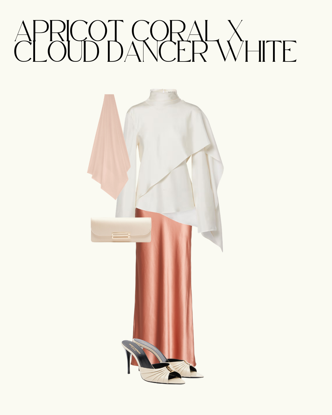
Outfit 1: Apricot Coral and Cloud Dancer White

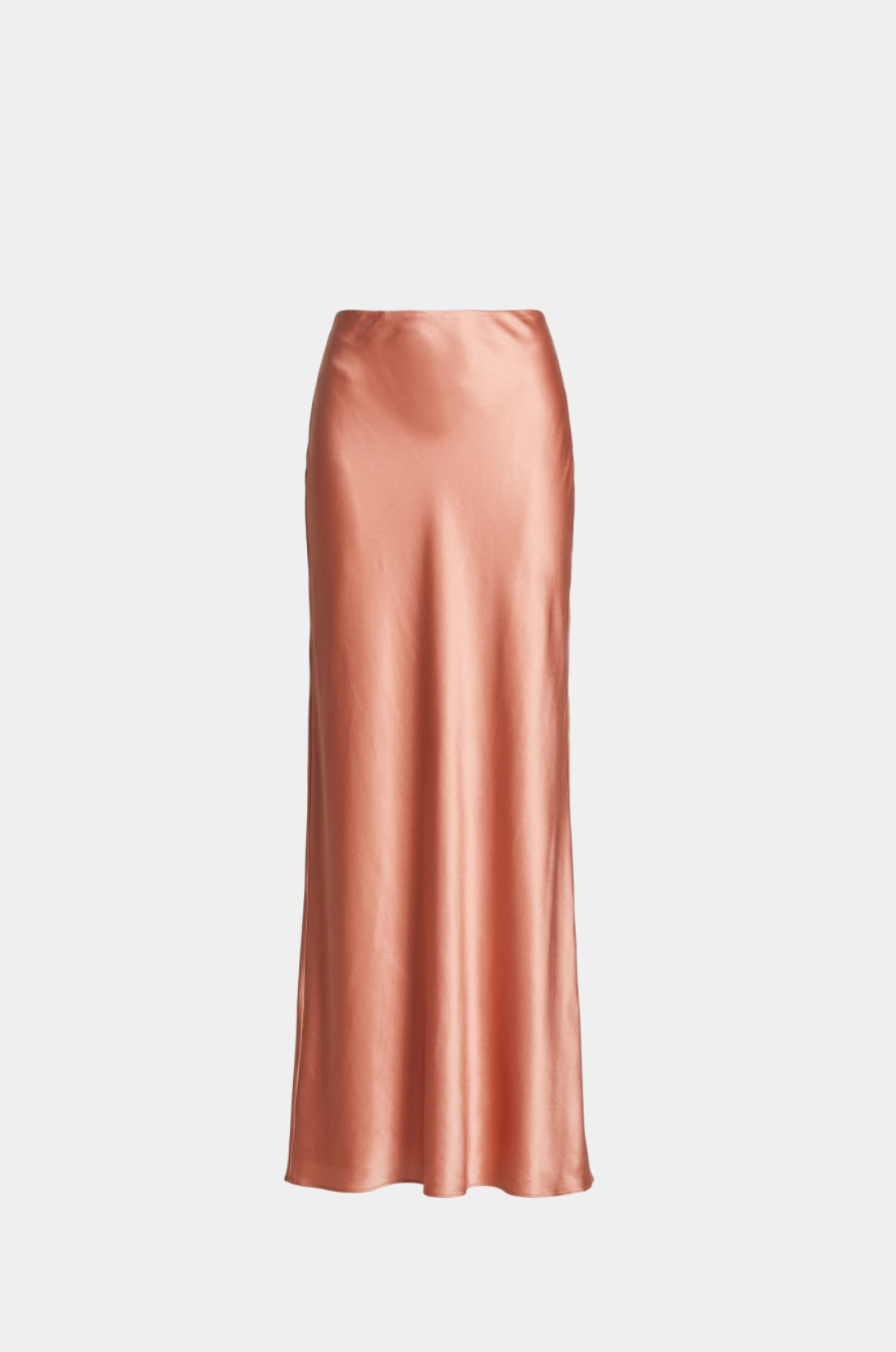
This is the combination that proves warm tones do not need to fight for attention. Apricot coral is a sunset shade that sits between peach and terracotta on the color wheel. Paired with Cloud Dancer white, it becomes the kind of outfit that photographs beautifully without trying too hard.


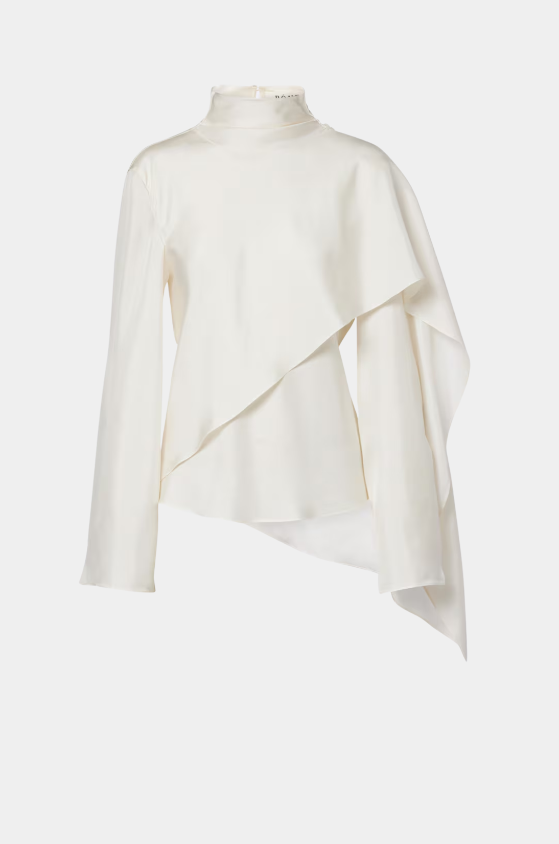
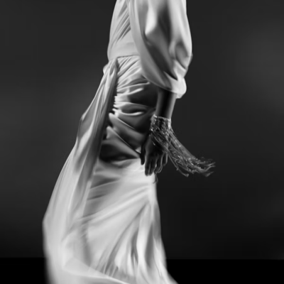
The foundation of this look is a Cult Gaia Chantel skirt in liquid apricot coral satin. The fabric catches light in a way that shifts the color between warm peach and deeper coral depending on the angle. On top, a Róhe caped silk satin turtleneck in white provides architectural drama through its asymmetric draping and bell sleeve. The cape detail creates movement and visual interest without adding volume where you do not want it.
 
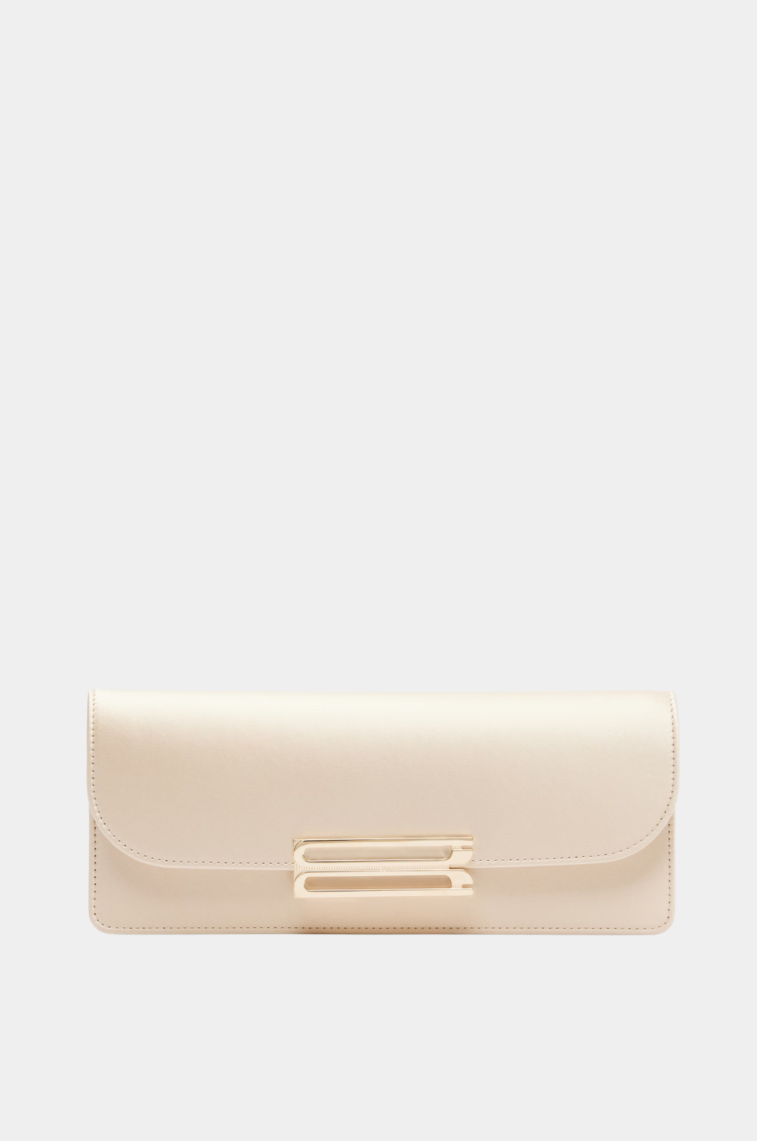
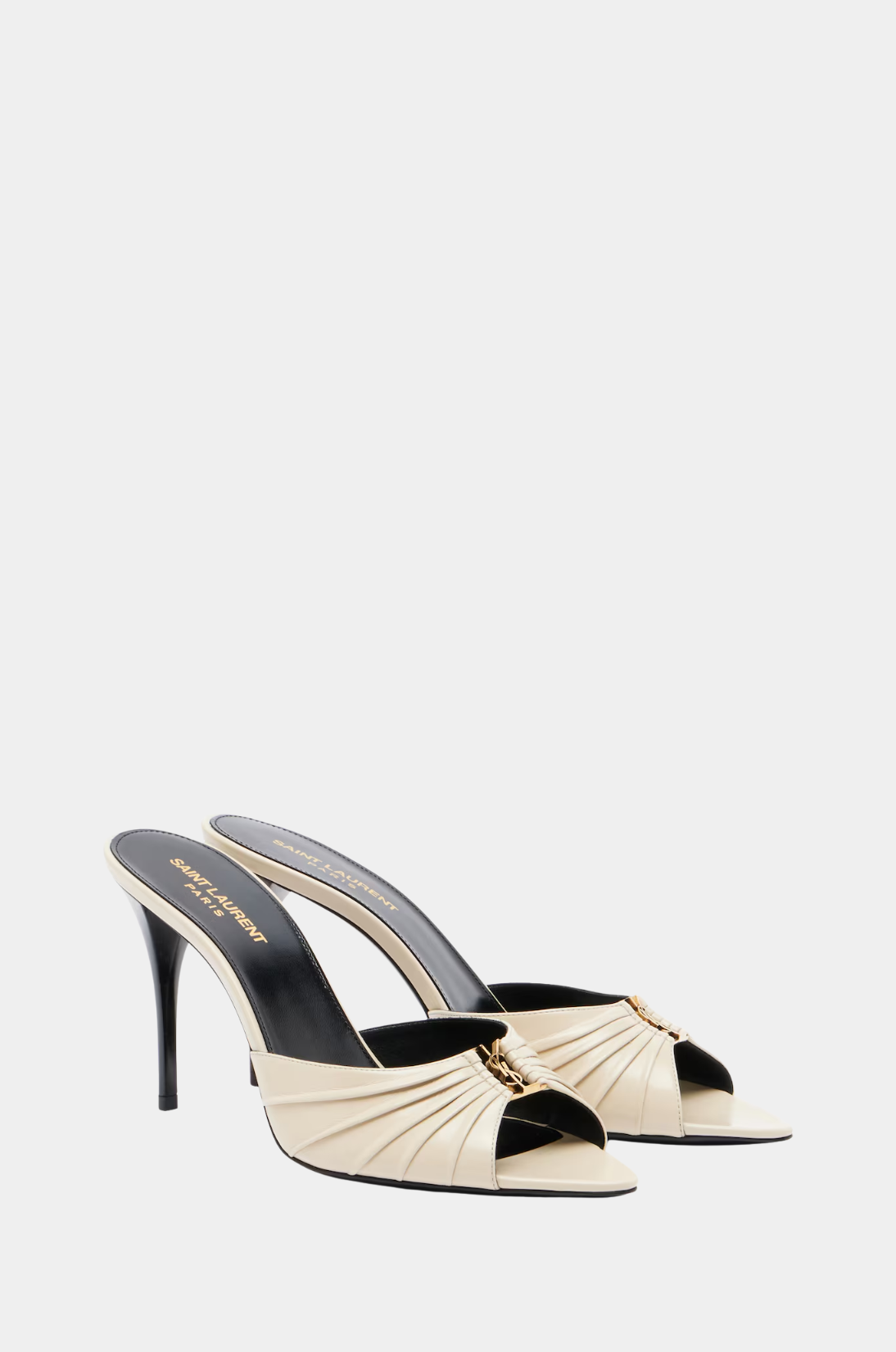
A Merrachi Deep Rose premium jersey scarf ties the two tones together, sitting right between the coral of the skirt and the white of the top. The accessories keep the palette cohesive. A Victoria Beckham Dorian East-West satin clutch in cream adds understated luxury, while Saint Laurent Babylone Cassandre leather mules in cream and black ground the outfit with a subtle edge.
 
This color combination works because apricot coral is inherently warm and approachable, and Cloud Dancer white gives it breathing room. Neither shade competes. They cooperate.

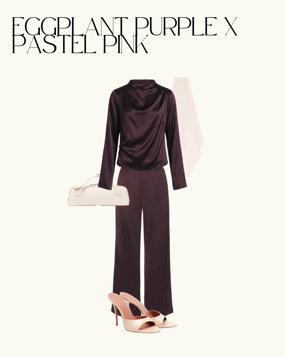
Outfit 2: Eggplant Purple and Pastel Pink

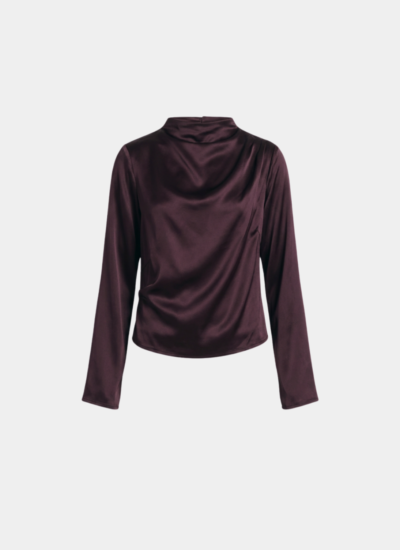
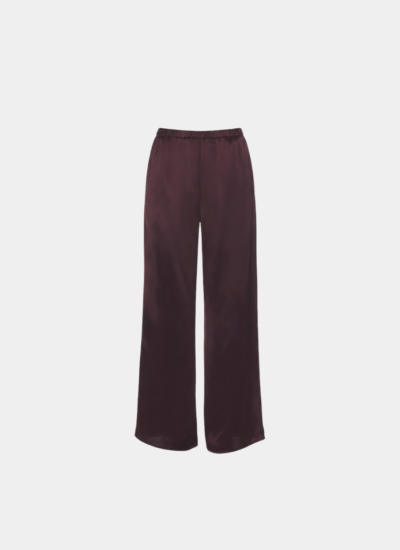
Deep eggplant purple is one of the most underused shades in modest fashion. It reads as dark and sophisticated from a distance but reveals rich undertones of plum and burgundy up close. When you pair it with pastel pink, something unexpected happens. The pink softens the intensity of the purple without diminishing its power. The result is an outfit that feels simultaneously romantic and commanding.
 
This look is built as a coordinated set from Revolve. The Petrea long sleeve top has a beautiful cowl neckline that drapes like silk, and the matching Petrea pant creates a clean, elongated line from shoulder to ankle. Wearing a single shade head to toe is one of the most effective styling techniques for creating the illusion of height and effortless polish.
 
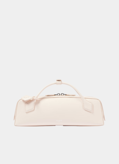
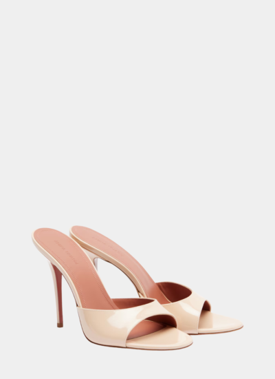
The pastel pink enters through the accessories. Amina Muaddi Elodie 105 patent leather mules in blush pink create a deliberate contrast at the hem. A Merrachi Peach Cream liquid jersey scarf adds a whisper of warmth near the face. And an Alaïa Le Teckel leather clutch in ivory bridges the two tones with its architectural shape and creamy finish.
 
The reason this combination works so well is rooted in color theory. Purple and pink sit near each other on the color wheel, which means they share enough visual DNA to feel harmonious. But the difference in saturation, deep versus pale, creates the contrast your eye needs to stay interested.

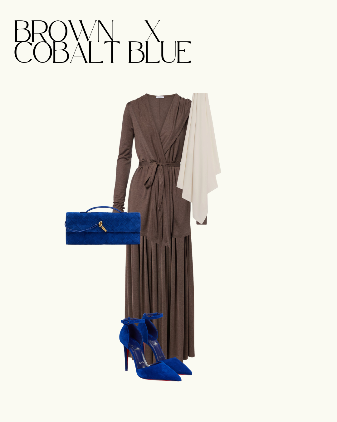
Outfit 3: Chocolate Brown and Cobalt Blue

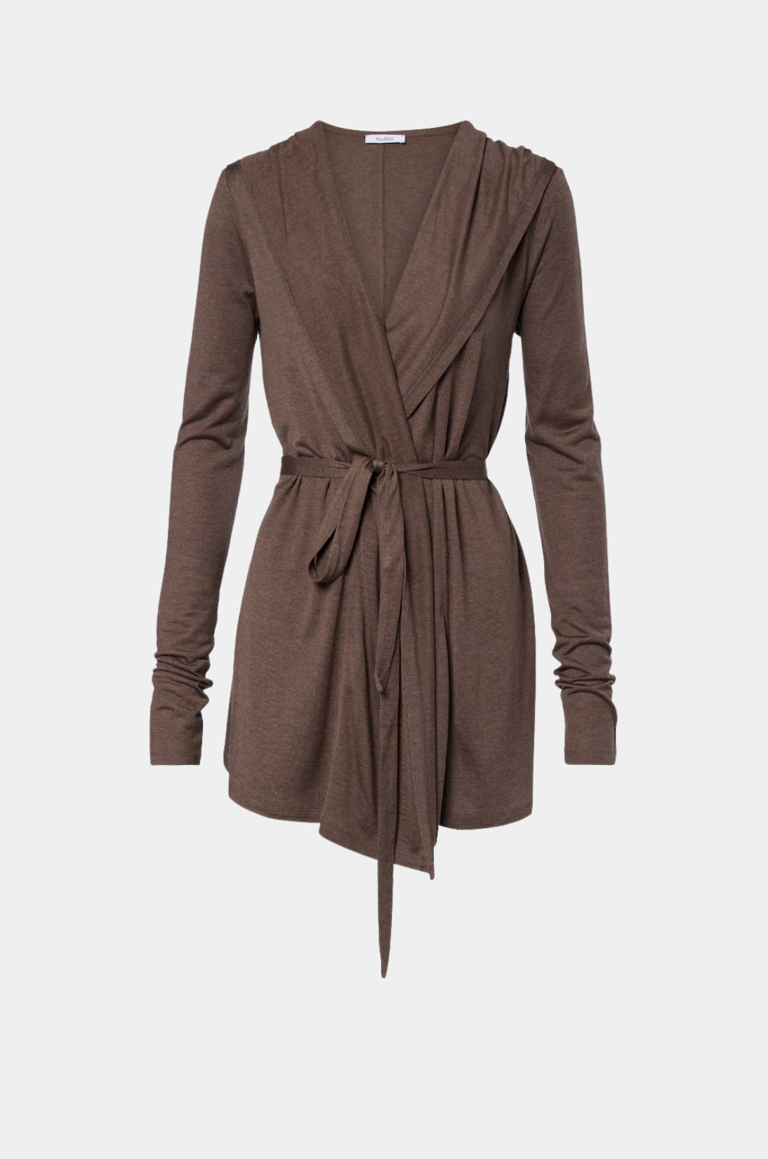
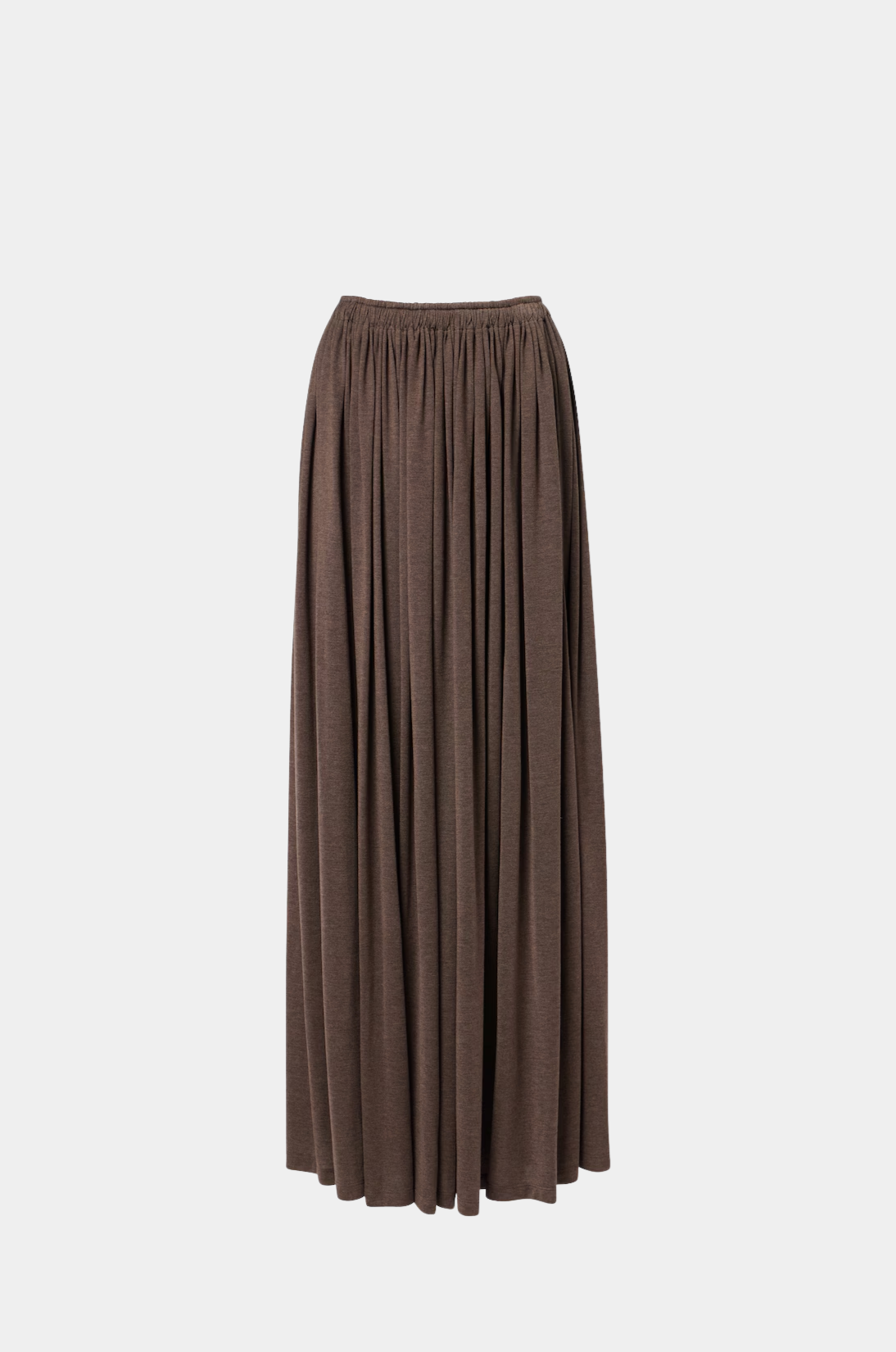
If there is one color combination that defines sophisticated dressing this summer, it is chocolate brown and cobalt blue. These two shades have no business looking this good together, and yet they create one of the most striking pairings of the season. Brown grounds an outfit in warmth and earthiness. Cobalt blue electrifies it with energy and depth. Together they produce something that feels old-money European with a modern edge.
 
This outfit centers on two Max Mara jersey pieces. The wrap cardigan in chocolate brown has a deep V-neckline and a self-tie waist that creates beautiful proportions. The matching jersey maxi skirt features knife pleats that add movement and texture without adding bulk. Jersey is the fabric of summer, comfortable enough for all-day wear but polished enough for any setting.
 
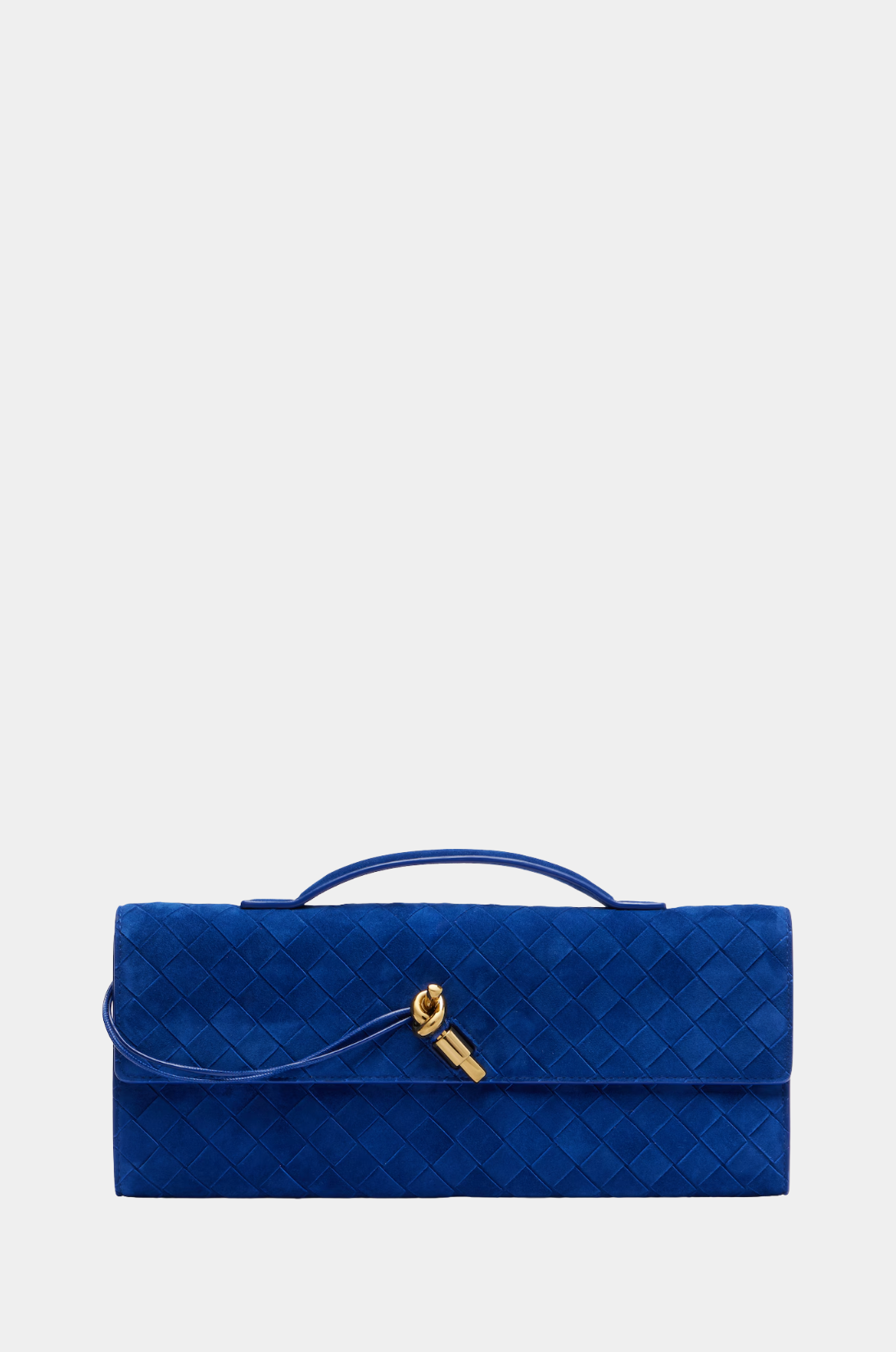
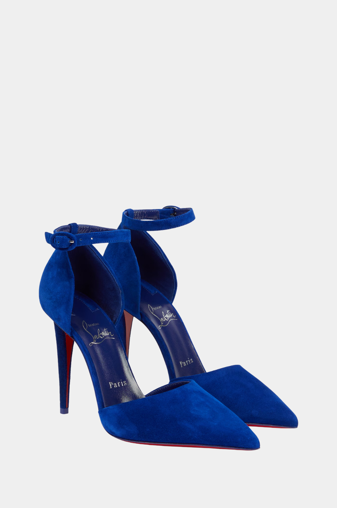
The cobalt blue arrives through Bottega Veneta’s Intrecciato suede clutch in electric blue and Jimmy Choo Brigitte suede pumps in the same shade. Keeping the statement color concentrated in the accessories makes the combination feel intentional rather than overwhelming. A Merrachi Soft Taupe premium jersey scarf in a neutral tone keeps the neckline area calm and balanced.
 
This pairing works because brown and blue are complementary in the broader color spectrum. Earth tones and sky tones have been worn together for centuries across cultures. The cobalt blue version simply amplifies that relationship into something contemporary and bold.

How to Build Your Own Color Combinations This Summer

The principle behind all three outfits is the same. Start with one shade that covers the largest surface area of your outfit, your base. Then introduce a second shade through accessories, shoes, or one key piece. The ratio matters. A 70/30 or 80/20 split between your dominant and accent colors will always look more refined than a 50/50 divide.


Pay attention to fabric as well. Satin amplifies color because it reflects light. Jersey softens it. Matte textures like suede make bold colors feel grounded rather than loud. The same cobalt blue that feels electric in patent leather becomes rich and sophisticated in suede.


If you are new to wearing color combinations, start with the brown and cobalt blue pairing. It feels closest to neutral territory while still making a strong statement. Once you build confidence there, try the apricot coral and white for something warmer, or the eggplant purple and pink for something more daring.

The Takeaway

Color combinations are the fastest way to make a simple outfit look expensive and intentional. You do not need twenty pieces in your wardrobe. You need two shades that understand each other. This summer, let apricot coral meet cloud dancer white, let eggplant purple play against pastel pink, and let brown come alive with cobalt blue. The formulas work. The brands behind these pieces have done the hard work of getting the shade exactly right. All you have to do is put them together.

FEATURED PIECES

Leave A Comment

Leave A Comment

Coveted for its luxury. Revered for its modesty

#Gallery

#Contact